Table of Contents
ToggleCream bedrooms strike a balance that bright white can’t, they soften harsh light, warm up cold architecture, and hide the minor imperfections that pure white broadcasts across every wall. Unlike trendy accent colors that feel dated within a season, cream tones anchor a room with flexibility. They let textiles, furniture, and wood finishes take center stage without competing for attention. Whether renovating a primary suite or refreshing a guest room, cream provides a foundation that works with nearly every design direction, from farmhouse shiplap to sleek contemporary paneling. This guide walks through shade selection, layering textures, and styling approaches that turn a simple neutral into a bedroom worth coming home to.
Key Takeaways
- Cream bedroom ideas work across every design style—from cottage farmhouse to modern minimalist—because their warm undertones hide imperfections and complement wood finishes that cool whites can clash with.
- Choose your cream shade based on natural light direction: yellow-based creams for north-facing rooms, pink-based for east or west exposures, and gray-based creams for south-facing spaces with strong daylight.
- Layer textures with linen bedding, chunky knit throws, natural rugs, and metal fixtures (brass, aged bronze, or matte black) to prevent the space from feeling flat and one-dimensional.
- Always paint wall swatches 8×10 inches directly on the wall and observe them at different times of day, since paint chips mislead and undertones shift dramatically once applied to larger surfaces.
- Architectural details like shiplap, board-and-batten wainscoting, or picture frame molding painted in cream create shadow lines and visual depth without introducing competing colors.
Why Cream Is the Perfect Bedroom Color Choice
Cream sits in that rare zone where paint does more than cover drywall, it shifts the room’s entire temperature. Unlike stark whites that amplify blue undertones in north-facing rooms, cream carries yellow, pink, or gray bases that counteract unflattering light. This makes it forgiving in spaces with inconsistent natural light throughout the day.
From a practical standpoint, cream hides scuffs and minor wall dings better than pure white. Touch-ups blend seamlessly, which matters in high-traffic bedrooms where furniture gets shifted during cleaning. It also shows less contrast against trim, making imperfect drywall joints and ceiling transitions less obvious, a bonus for older homes where settling has created minor cracks.
Cream works across design styles without feeling forced. Pair it with reclaimed wood beams and linen for a cottage aesthetic, or combine it with black metal fixtures and concrete accents for a modern industrial look. The neutrality doesn’t read as bland because the warmth prevents that sterile, builder-grade feel.
Another advantage: cream coordinates with wood tones that clash with cooler whites. Oak, pine, and maple furniture, common in inherited or secondhand pieces, look intentional against cream walls rather than dated. This reduces the pressure to replace functional furniture just to match a paint scheme.
Essential Elements for Creating a Cream Bedroom
Choosing the Right Cream Shade for Your Walls
Paint chips lie. What looks like a safe “vanilla cream” on a 2×2 sample can shift green or peach once it covers 200 square feet of wall. Always test with an 8×10-inch swatch painted directly on the wall, observed at different times of day.
Undertones matter more than the name on the can. Creams break into three camps: yellow-based (warm, honey-leaning), pink-based (soft, slightly rosy), and gray-based (cooler, modern). Yellow-based creams work well in rooms with north-facing windows, adding warmth where natural light runs cold. Pink-based creams suit east or west exposures, complementing morning and evening light without turning orange. Gray-based creams fit south-facing rooms with strong daylight, preventing the space from feeling too hot.
Sheen affects both durability and appearance. Eggshell or satin finishes are standard for bedrooms, they clean easier than flat paint and don’t spotlight wall texture like semi-gloss. Flat paint works if the drywall is flawless and the room sees low activity, but it’s harder to wipe down.
One often-missed step: check the cream against your ceiling paint. Most ceilings use builder white with blue or neutral undertones. If the contrast is too stark, the ceiling can feel dingy or the walls too yellow. Some painters tint ceiling paint with a few drops of the wall color to create a subtle transition.
Many successful bedroom makeovers start with proper prep, patching holes with lightweight spackle, sanding smooth, and priming stained or dark walls. Skipping primer lets old colors bleed through, especially reds or deep blues, requiring extra coats that waste time and material.
Selecting Complementary Textures and Fabrics
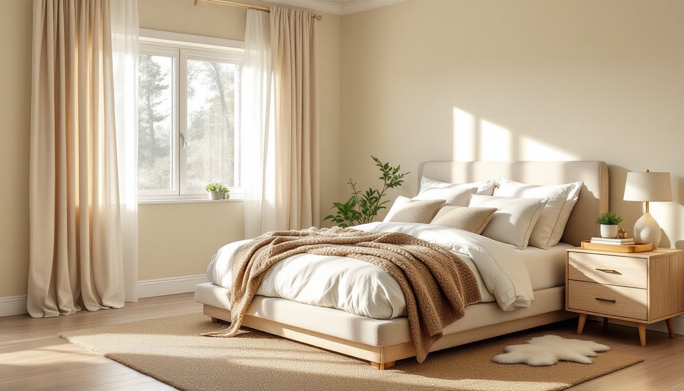
Cream bedrooms live or die on texture. Flat, monochrome surfaces read as unfinished, while layered materials add depth without clutter. Start with bedding: a linen duvet in off-white or natural provides subtle slub texture that catches light differently than smooth cotton. Add a chunky knit throw in oatmeal or camel at the foot of the bed for contrast in both weight and weave.
Curtains should either blend or provide deliberate contrast. Linen or cotton drapes in cream or ivory maintain the soft palette, while blackout liners add function without changing the visual. For contrast, consider charcoal, sage, or terracotta panels, these ground the space and prevent it from feeling too airy.
Rug choice anchors the room. A jute or sisal rug adds organic texture and works under most bed frames, though it can feel rough underfoot, layer a sheepskin or smaller wool rug on top for softness where feet land. Wool rugs in geometric or subtle patterns introduce pattern without overwhelming the neutral base.
Wood finishes bring warmth and variation. Light oak or whitewashed furniture keeps the tone-on-tone feel: walnut or espresso pieces create contrast and visual weight. Avoid mixing too many wood tones, pick two finishes and repeat them across furniture, frames, and accents.
Metal fixtures matter more in neutral rooms where they stand out. Brass or aged bronze hardware (drawer pulls, lamp bases, curtain rods) adds warmth. Matte black or brushed nickel keeps things modern and crisp. Mixing metals works if you stick to two finishes, brass and black, for example, and distribute them evenly so one doesn’t dominate a single corner.
Texture also comes from architectural details. Shiplap, board-and-batten wainscoting, or picture frame molding painted in the same cream creates shadow lines and dimension. If adding trim, use MDF or pine primed boards, paint-grade lumber is cheaper than stain-grade and disappears under a few coats. According to design experts at House Beautiful, layering creams with natural materials prevents the space from feeling flat.
Cream Bedroom Design Styles and Inspirations
Modern Minimalist Cream Bedrooms
Modern minimalist spaces strip out excess but retain intentionality. Walls in a gray-cream or greige set a cooler foundation. Furniture stays low-profile, platform beds with integrated nightstands eliminate visual clutter. Avoid ornate headboards: a simple upholstered panel in linen or a floating wood slab keeps lines clean.
Lighting does heavy lifting here. Recessed LED cans provide even ambient light, while adjustable track lights or picture lights highlight art or architectural features. Pendant lights with simple geometric shades (sphere, cylinder, cone) work over nightstands if hardwired, avoid plug-in cords snaking down walls.
Keep accessories minimal and functional. A single ceramic vase on a dresser, a stack of three hardcover books, or a small potted succulent. Avoid tchotchkes or clustered frames. Storage should be hidden, floating shelves in matching cream or light wood, or a low credenza with push-latch doors.
Flooring in modern cream bedrooms often skews hard surface, engineered hardwood in light oak, luxury vinyl plank (LVP) in pale gray-wash, or polished concrete if the home supports it. Area rugs should be geometric, low-pile, and neutral: cream, gray, or black.
Window treatments stay simple. Roller shades in white or cream, or floor-length panels in a single solid color with no pattern. Hardware mounts to the ceiling for a cleaner line and makes ceilings feel taller, especially useful in rooms with standard 8-foot ceilings.
Cozy Traditional and Cottage-Style Cream Spaces
Traditional cream bedrooms embrace layering, pattern, and collected-over-time charm. Walls in a warm, buttery cream create the base. Trim, crown molding, and baseboards get a slightly brighter white for definition, this contrast is classic in older homes with detailed millwork.
Bedding stacks: a quilted coverlet or matelassé bedspread in cream or ivory, layered with patterned euro shams (ticking stripe, toile, small florals), and a mix of throw pillows in complementary colors like dusty blue, blush, or moss green. Down or down-alternative inserts keep pillows plump, 20×20-inch and 12×20-inch lumbar sizes mix well.
Furniture leans traditional, wood dressers with turned legs, upholstered headboards with nailhead trim, bedside tables with drawers and lower shelves. Distressed or painted finishes in cream, white, or sage fit cottage aesthetics. If refinishing secondhand furniture, light sanding and a coat of chalk paint or milk paint skips the need for extensive stripping.
Lighting includes table lamps with fabric shades on nightstands, and possibly a small chandelier or semi-flush mount fixture overhead. Vintage or reproduction brass fixtures add warmth. Avoid overly shiny finishes, antique brass or oil-rubbed bronze feels more authentic.
Textiles bring pattern and color. A faded Persian or Oriental rug in cream, rust, and navy grounds the space with history. Curtains in linen, cotton, or even a light floral print soften windows. Designers featured on MyDomaine often suggest mixing prints in similar color families but varied scales, small checks with larger florals, for example.
Accessories can be more abundant: framed botanical prints, ceramic pitchers used as vases, stacks of vintage books, a wooden tray corralling perfume bottles. Open shelving or a small bookcase displays collections without looking cluttered if items stay within the cream-and-earth-tone palette.
Wall treatments add character. Beadboard wainscoting painted cream with walls a shade lighter, or a subtle striped wallpaper in cream and white, gives depth. If installing beadboard, use ¼-inch or ⅜-inch MDF panels over furring strips, which is easier than individual planks and hides minor wall imperfections.
For more detailed room design inspiration, Home Bunch features real homes with step-by-step styling that shows how layers build finished looks.


